Creating a successful ad campaign aimed at a premium audience is about more than just high-quality products and slick imagery — it’s also about *presentation*. One of the most overlooked yet vital components of design for luxury and upscale markets is typography. The right font can speak volumes before a single word is read, while the wrong one can subtly degrade the brand’s image.
TL;DR — The Short Version
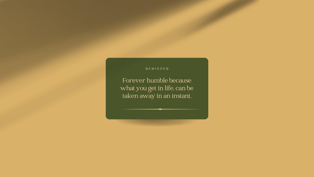
Luxury audiences judge quality by every detail, including typography. Fonts used in premium advertising should evoke elegance, sophistication, and trustworthiness. Serif fonts like Garamond and Didot are often favored, while sans-serifs like Helvetica Neue and Avenir bring minimalist charm. Ultimately, the best font is one that aligns perfectly with your brand’s luxury narrative.
Why Fonts Matter for Premium Audiences
Fonts impact perception. When targeting affluent and discerning customers, your typography must convey *exclusivity* and *refinement*. Every visual element should support your brand’s promise of premium value.
A premium font can:
- Establish immediate trust
- Communicate class, heritage, or innovation
- Draw attention to important details without shouting
- Complement high-quality photography and minimalistic designs
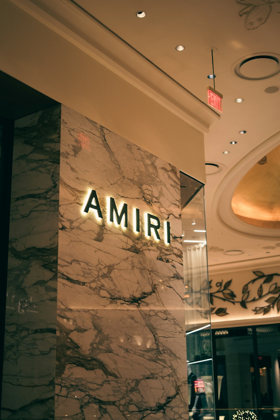
Think of the world’s most iconic brands: Chanel, Apple, Rolex. They all use typography to build powerful visual identities. A luxury font integrates seamlessly into the overall design and enhances it, often becoming as recognizable as the brand logo itself.
Top Fonts That Speak to Sophistication
We’ve curated a list of the best fonts for premium audience ads. These fonts have been chosen for their elegance, timelessness, and strong association with upscale branding.
1. Didot — The Essence of High Fashion
Didot is often seen gracing the covers of high-end fashion magazines like Vogue and Harper’s Bazaar. Its ultra-thin strokes combined with bold vertical lines give it a striking, high-contrast appearance.
Best for: Fashion, beauty, luxury goods
Why it works: It embodies style and exclusivity, making viewers feel like they’re engaging with something rare and special.
2. Garamond — A Classic With Literary Heritage
With roots tracing back to the 16th century, Garamond carries a rich tradition of print and design. It’s elegant but subtle, perfect for conveying understated luxury.
Best for: Lifestyle brands, premium real estate, art galleries
Why it works: It communicates intelligence, trust, and heritage — perfect for a brand that wants to emphasize tradition and sophistication.
3. Bodoni — Bold With Balance
Much like Didot, Bodoni balances thick and thin strokes but carries a slightly rounder appearance. It adds drama and makes a bold statement without losing refinement.
Best for: Jewelry, expensive spirits, and editorial design
Why it works: It’s eye-catching yet graceful, blending the ornate with the sophisticated.
4. Helvetica Neue — Clean Swiss Precision
Although technically a sans-serif, Helvetica Neue is a favorite of luxury tech brands and modern minimalist product lines. It’s incredibly clean, neutral, and adaptable — all crucial for sleek ad design.
Best for: High-end electronics, design-forward fashion, architecture
Why it works: Neutrality is its strength—it lets your premium content shine without distraction.
5. Avenir — The Forward-Thinking Choice
Simple yet stylish, Avenir strikes a balance between personality and professionalism. It feels less “sterile” than Helvetica but still very modern and clean.
Best for: Creative agencies, upscale travel, digital services
Why it works: It signals innovation and contemporary luxury — subtle but effective.
Honorable Mentions
If you’re looking to stand out while still targeting an upscale audience, consider these excellent alternatives:
- Futura: Timeless geometry ideal for cosmetics and design brands
- Trajan: Commonly used in luxury cinema and law firms, it’s commanding and elegant
- Playfair Display: Particularly well-suited for luxury editorial websites and online blogs
- Caslon: Another historical serif offering warmth and authority
Choosing the Right Font for Your Brand
Fonts are not one-size-fits-all, even in the luxury world. Choosing the perfect typeface for your premium advertising depends on understanding your audience and your brand narrative.
Ask Yourself:
- Is my brand traditional or modern? Serifs often say classic; sans-serifs feel contemporary.
- Do I want to be bold or understated? Bodoni makes a statement. Garamond whispers trust.
- Where will the ad appear? Web vs. print may influence your choice in font legibility and impact.
Remember, less is often more in the world of luxury. Don’t clutter your design with too many fonts. Choose one or two complimentary styles that convey visual hierarchy without noise.
Combining Fonts for Luxury Impact
Mixing fonts can add texture and emphasis, but it must be done carefully. For premium audiences, contrast should never feel jarring.
Here are some classic pairings that work well:
- Playfair Display + Avenir: Traditional meets modern
- Garamond + Helvetica Neue: Heritage and precision
- Bodoni + Futura: Flair with function
Use serif fonts for headings and sans-serif for smaller body text to maintain readability while adding visual depth.
Colors, Fonts, and the Luxury Connection
A typeface will not live in a vacuum — the choice of color and layout enhances or undermines it. Many premium ads use low-contrast, monochromatic palettes that work harmoniously with the font style.
Stick to traditional combinations like cream and black, navy and gold, or charcoal and white, which evoke opulence and timelessness. Let your font add texture without overwhelming the message.
Final Thoughts
Typography is more than an aesthetic choice — it’s a strategic one that can define your brand in the eyes of a luxury consumer. The best fonts for premium audience ads are those that silently, powerfully, tell your brand’s story the moment they’re seen.
So whether you’re preparing a glossy magazine ad or a sleek digital campaign, ask yourself — does your font *feel* premium enough? Because your most discerning customers can tell the difference.
