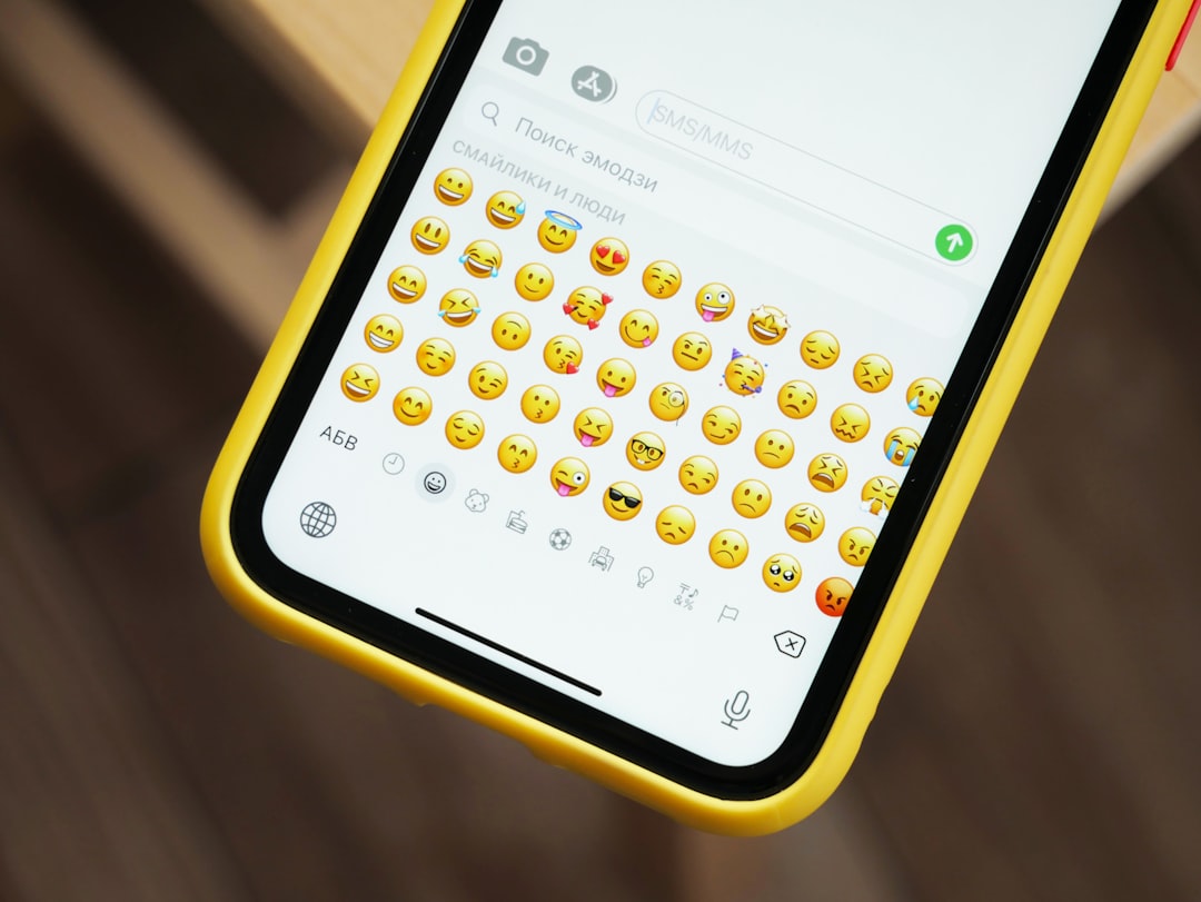
Designers love dark mode. It’s stylish, sleek, and easier on the eyes for many users. But sometimes, not everything blends so smoothly into that dark palette. One color, in particular, tends to cause some drama. Yep, we’re talking about yellow.
TL;DR
Yellow on dark backgrounds can be hard to read and even painful for some users. It tends to appear super bright or fuzzy, especially on lower-quality screens. Accessibility matters—designs shouldn’t just look cool, they must also be readable for everyone. Better color choices and contrast tools can make all the difference.
Why Designers Love Yellow in Dark Mode
Yellow pops. On a black or very dark background, yellow demands attention. That makes it a popular choice for:
- Notifications
- Highlights
- Warning messages
- Call-to-action buttons
It screams, “Hey you! Look here!” Which is fine… until it screams a little too loud.
The Science of Color and Vision
Let’s break this down. Your eyes aren’t just pretty—they’re picky too. Here’s what happens when yellow shows up on black:
- Chromatic aberration: Your eyes bend colors slightly at different angles. Yellow on black often appears to “glow” or look blurry.
- Color vibration: When two colors have high contrast—like bright yellow on black—they can seem to vibrate where they meet.
- Overstimulation: Very bright yellow can be harsh on the eyes in dark settings, causing fatigue or discomfort.
All this means that what’s eye-catching to one person might be eye-watering to another.
The Accessibility Angle
Accessibility in design ensures that content can be used and understood by as many people as possible, including those with visual impairments.
Bright yellow on black creates some real issues here:
- Low readability: The shine of yellow can create glare on screens, making text hard to read.
- Invisible for some: People with certain types of color blindness might not see yellow well—or at all—against a dark background.
- Screen quality matters: Not all displays show color the same way. Yellow might look great on a fancy monitor and terrible on an older laptop.
As fun as yellow is, we need to think about everyone who might be trying to read it.
Understanding Color Contrast
There’s a little formula that helps: contrast ratio. It measures how different two colors are in brightness. The higher the number, the better the contrast—and better doesn’t always mean more “pop.”
According to the Web Content Accessibility Guidelines (WCAG), text should have a ratio of at least 4.5:1 for normal sizes, and 3:1 for large text.
Bright yellow (#FFFF00) on black (#000000) technically has a high contrast ratio. But perception isn’t all math. Sometimes, our eyes trick us into thinking it’s hard to read. That’s why actual testing with users is important.
Better Ways to Use Yellow
If you want the energy of yellow without the problems, here are some tricks:
- Soften the yellow: Use mustard tones or golds instead of neon. Example: #FFD700 or #F4D03F.
- Use bold fonts: Thicker letters are easier to read in bright colors.
- Add shadows or outlines: This can help yellow text stand out and be more legible.
- Limit its use: Keep yellow for small, key highlights. Don’t write whole paragraphs in it.
The goal is balance—noticeable, but not blinding.
Great Alternatives to Yellow
Don’t worry, yellow is not your only BFF in dark mode. There are other colors that grab attention while being easier on the eyes. Try these:
- Soft orange (#FFA07A): Warm and friendly.
- Medium turquoise (#00CED1): Cool and calming, still stands out.
- Hot pink (#FF69B4): Playful but legible if used sparingly.
- Light green (#90EE90): Feels fresh and readable.
These colors provide contrast and comfort—something yellow often forgets to do.
Testing for Accessibility
The best way to see if your yellow is accessible? Test it!
Here’s how:
- Use a contrast checker: Tools like WebAIM Contrast Checker can instantly rate color combinations.
- Try dark mode preview tools: Tools like Stark or Axe let you simulate how designs look in dark mode.
- Ask real users: Especially those with visual impairments or color blindness.
Designers aren’t mind readers. So don’t guess. Test.

Famous Failures (And Wins)
Some big brands have stumbled with yellow in dark mode. Others nailed it. Here’s what we can learn:
- Fail: Early Twitter dark mode used bright links that included yellow hues. Users complained about headaches.
- Win: Slack uses more subdued tones in dark mode, combining navy, purples, and subtle yellows that don’t glare.
- Mixed: Spotify uses bright green on black but avoids bold yellow for good reason—contrast matters for legibility, and they seem to know it.
Good design doesn’t mean flashy. It means readable, usable, and comfy.
Final Thoughts
Designers love to play. Colors are toys, and yellow is the loud sibling that everyone notices at a party. But in dark mode, that sibling can get a bit… obnoxious. When it comes to accessibility, the cool factor should never outrank actual usability.
Always think about your users’ eyes, not just your aesthetic sense. A little testing, a touch of color finesse, and a shift away from pumpkin-blast yellow can go a long way.
So go bold—just not blinding.
Takeaways
- Yellow + dark mode = tricky combo.
- Too bright? Might hurt readability.
- Test for contrast. Don’t assume.
- Better to use gentler tones, bold fonts, and minimalist yellow placement.
Design smarter, not just louder.
