Every product team eventually faces the “Frankenstein” moment.
A UI designer grabs a chevron from an open-source pack. Then, they pull a settings cog from a previous project. Finally, they download a user profile icon from a marketplace. Individually, these assets look fine. Together, the line weights clash. The corner radii differ. The visual language falls apart.
Growing teams struggle to maintain consistency without dedicating a full-time illustrator to build a proprietary icon set.
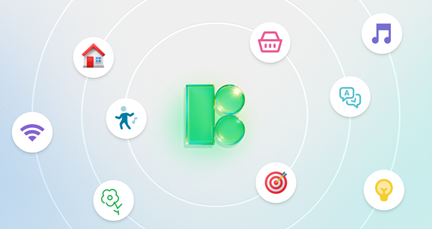
Icons8 tackles this problem. It operates less like a search engine for assets and more like a system of standardized styles. With over 1.4 million icons, the platform’s value isn’t just volume; it is the depth within specific style packs. Commit to the “iOS 17” style, and you don’t just get basic interface elements. You get access to 30,000+ icons that follow the exact same grid, stroke width, and aesthetic guidelines.
The Workflow: From Design to Implementation
To see if this tool fits your stack, look at how it integrates into the production pipeline.
Scenario 1: The UI Designer in a High-Velocity Environment
Complex dashboards often exhaust standard open-source libraries. A generic “server” icon is easy to find. A “server crash with warning” or “database migration” icon is rare.
Designers using Icons8 select a style, such as “Material Outlined” (containing over 5,500 icons) or “Windows 11.” They use the Figma plugin or the Mac app, Pichon, to drag and drop assets directly into the canvas.
Critically, when product requirements shift, the workflow adapts. Perhaps stakeholders decide the app needs a friendlier, less technical look. The designer doesn’t have to redraw everything. They switch the library search to “3D Fluency” or “Hand Drawn,” find the same metadata tags, and replace the assets.
Since icons are available as SVGs in paid plans, designers can uncheck the “Simplified” option. This unlocks editable vector paths, letting them tweak a node in Illustrator or Lunacy without rebuilding the icon from scratch.
Scenario 2: The Developer and the Asset Handoff
File management often kills developer momentum. Receiving a Zip file of SVGs via email is inefficient. Icons8 manages this through Collections.
A designer creates a collection for a specific project, organizes the assets, and shares a link. The developer accesses that collection and chooses the format that fits the tech stack.
- Web Projects: Grab the CDN link to embed the icon directly into HTML. Alternatively, copy the Base64 fragment to avoid external requests.
- Mobile Apps: If the design calls for motion, download Lottie JSON files. These small, scalable animations work natively on iOS and Android, replacing heavy video files or complex CSS.
- Customization: Brand colors change at the last minute. Developers can apply a bulk recolor to the entire collection using HEX codes before downloading. All assets match the new theme instantly.
A Day in the Life: The Content Manager
Jules is a content manager responsible for a company’s internal knowledge base and external presentations. Here is how the platform functions for a non-technical user.
09:00 AM: Jules needs to structure a new documentation page about social media policies. The text is dense. Visual breaks are necessary.
09:15 AM: He opens Icons8 and filters for “Office” style icons. The goal is a professional look that remains distinct from the app’s UI.
09:20 AM: He finds a “Document” icon. The default black doesn’t fit the company’s dark blue branding. He clicks the icon to open the in-browser editor and inputs the company’s specific RGB values to recolor it.
09:25 AM: A section on messaging apps requires illustration. He searches and finds a whatsapp icon that fits the style. But the slide background is dark. He uses the editor to toggle the icon to white.
09:30 AM: The icon needs more presence. Using the “Add” features in the editor, he places a “Square” background behind the icon. He rounds the corners to create a “squircle” and adjusts the padding.
09:45 AM: Jules downloads the assets as 100px PNGs (free) and drops them into his slide deck. He adds the attribution link to the final slide to comply with the free license.
Comparing Icons8 to Alternatives
 The icon market is crowded. Tools generally fall into three buckets. Here is how Icons8 stacks up.
Vs. Open Source (Feather, Heroicons)
Open-source packs work well for early-stage startups or personal projects. They are free and usually vector-based. But they are shallow. A typical pack might have 200–300 icons. Once a product becomes complex, you hit a wall. The icon you need simply doesn’t exist, forcing you to design it yourself and break consistency. Icons8 solves the “coverage” problem with packs containing 10,000+ assets.
Vs. Marketplaces (Noun Project, Flaticon)
Marketplaces aggregate content from thousands of designers. Variety is infinite, but consistency is poor. “Line style” from Artist A looks different than “Line style” from Artist B. Icons8 produces assets in-house or through strict curation. Visual weight and corner rounding remain consistent across the entire pack.
Vs. In-House Design
Building a custom set is the gold standard for branding. It also requires massive ov
Maintaining Visual Consistency Without the Overhead: An Icons8 Review
Every product team eventually faces the “Frankenstein” moment.
A UI designer grabs a chevron from an open-source pack. Then, they pull a settings cog from a previous project. Finally, they download a user profile icon from a marketplace. Individually, these assets look fine. Together, the line weights clash. The corner radii differ. The visual language falls apart.
Growing teams struggle to maintain consistency without dedicating a full-time illustrator to build a proprietary icon set.
Icons8 tackles this problem. It operates less like a search engine for assets and more like a system of standardized styles. With over 1.4 million icons, the platform’s value isn’t just volume; it is the depth within specific style packs. Commit to the “iOS 17” style, and you don’t just get basic interface elements. You get access to 30,000+ icons that follow the exact same grid, stroke width, and aesthetic guidelines.
The Workflow: From Design to Implementation
To see if this tool fits your stack, look at how it integrates into the production pipeline.
Scenario 1: The UI Designer in a High-Velocity Environment
Complex dashboards often exhaust standard open-source libraries. A generic “server” icon is easy to find. A “server crash with warning” or “database migration” icon is rare.
Designers using Icons8 select a style, such as “Material Outlined” (containing over 5,500 icons) or “Windows 11.” They use the Figma plugin or the Mac app, Pichon, to drag and drop assets directly into the canvas.
Critically, when product requirements shift, the workflow adapts. Perhaps stakeholders decide the app needs a friendlier, less technical look. The designer doesn’t have to redraw everything. They switch the library search to “3D Fluency” or “Hand Drawn,” find the same metadata tags, and replace the assets.
Since icons are available as SVGs in paid plans, designers can uncheck the “Simplified” option. This unlocks editable vector paths, letting them tweak a node in Illustrator or Lunacy without rebuilding the icon from scratch.
Scenario 2: The Developer and the Asset Handoff
File management often kills developer momentum. Receiving a Zip file of SVGs via email is inefficient. Icons8 manages this through Collections.
A designer creates a collection for a specific project, organizes the assets, and shares a link. The developer accesses that collection and chooses the format that fits the tech stack.
- Web Projects: Grab the CDN link to embed the icon directly into HTML. Alternatively, copy the Base64 fragment to avoid external requests.
- Mobile Apps: If the design calls for motion, download Lottie JSON files. These small, scalable animations work natively on iOS and Android, replacing heavy video files or complex CSS.
- Customization: Brand colors change at the last minute. Developers can apply a bulk recolor to the entire collection using HEX codes before downloading. All assets match the new theme instantly.
A Day in the Life: The Content Manager
Jules is a content manager responsible for a company’s internal knowledge base and external presentations. Here is how the platform functions for a non-technical user.
09:00 AM: Jules needs to structure a new documentation page about social media policies. The text is dense. Visual breaks are necessary.
09:15 AM: He opens Icons8 and filters for “Office” style icons. The goal is a professional look that remains distinct from the app’s UI.
09:20 AM: He finds a “Document” icon. The default black doesn’t fit the company’s dark blue branding. He clicks the icon to open the in-browser editor and inputs the company’s specific RGB values to recolor it.
09:25 AM: A section on messaging apps requires illustration. He searches and finds a whatsapp icon that fits the style. But the slide background is dark. He uses the editor to toggle the icon to white.
09:30 AM: The icon needs more presence. Using the “Add” features in the editor, he places a “Square” background behind the icon. He rounds the corners to create a “squircle” and adjusts the padding.
09:45 AM: Jules downloads the assets as 100px PNGs (free) and drops them into his slide deck. He adds the attribution link to the final slide to comply with the free license.
Comparing Icons8 to Alternatives
The icon market is crowded. Tools generally fall into three buckets. Here is how Icons8 stacks up.
Vs. Open Source (Feather, Heroicons)
Open-source packs work well for early-stage startups or personal projects. They are free and usually vector-based. But they are shallow. A typical pack might have 200–300 icons. Once a product becomes complex, you hit a wall. The icon you need simply doesn’t exist, forcing you to design it yourself and break consistency. Icons8 solves the “coverage” problem with packs containing 10,000+ assets.
Vs. Marketplaces (Noun Project, Flaticon)
Marketplaces aggregate content from thousands of designers. Variety is infinite, but consistency is poor. “Line style” from Artist A looks different than “Line style” from Artist B. Icons8 produces assets in-house or through strict curation. Visual weight and corner rounding remain consistent across the entire pack.
Vs. In-House Design
Building a custom set is the gold standard for branding. It also requires massive overhead. You aren’t just drawing icons; you are maintaining, exporting, and updating them. Icons8 acts as a surrogate in-house team. Unless your brand relies on a very specific, unique illustration style, the ROI of a pre-made system is significantly higher.
Limitations and When to Look Elsewhere
Icons8 is not the right solution for every scenario.
- Strict Vector Requirements on a Budget: The free plan is raster-heavy. You get PNGs up to 100px. If you need SVGs for responsive web design and have zero budget, stick with an open-source library like Heroicons. Icons8 locks most vector formats behind a paywall.
- Hyper-Niche Diagrams: The library is vast, but specific technical symbols-like hydraulic schematics or obscure biological diagrams-might not be available.
- Attribution Constraints: Building a white-label product for a client? You cannot include a link back to Icons8. You must upgrade to a paid plan. The free tier strictly requires attribution.
Practical Tips for Power Users
Use the “Request” Ecosystem
Don’t wait passively if a specific icon is missing. The platform has a request feature where users vote on missing assets. If a request gets 8 likes from the community, it enters production. This strategy works well for teams planning features a few weeks in advance.
Check “Simplified” SVG Settings
When downloading SVGs, the default setting is “Simplified.” This merges shapes and cleans up code, which is excellent for web performance. But if you plan to animate individual parts (like making clock hands spin) or edit the shape in Illustrator, uncheck this box. It preserves groups and layers.
Bulk Recolor for Collections
Never recolor icons one by one. Add everything for a project into a Collection. From the collection view, apply a single color palette to dozens of icons simultaneously before exporting. This is the fastest way to generate a themed icon set for dark mode interfaces.
Browse “Popular” for Free Vectors
If you are on the free plan but absolutely need vectors, check the “Popular” category. Unlike specialized styles, this category often unlocks SVG and PDF formats without a subscription, though attribution is still required.
Treat Icons8 as managed infrastructure rather than a gallery of images. Teams can solve the consistency problem permanently, freeing up design resources to focus on UX and layout rather than drawing arrows and trash cans.
erhead. You aren’t just drawing icons; you are maintaining, exporting, and updating them. Icons8 acts as a surrogate in-house team. Unless your brand relies on a very specific, unique illustration style, the ROI of a pre-made system is significantly higher.
Limitations and When to Look Elsewhere
Icons8 is not the right solution for every scenario.
- Strict Vector Requirements on a Budget: The free plan is raster-heavy. You get PNGs up to 100px. If you need SVGs for responsive web design and have zero budget, stick with an open-source library like Heroicons. Icons8 locks most vector formats behind a paywall.
- Hyper-Niche Diagrams: The library is vast, but specific technical symbols-like hydraulic schematics or obscure biological diagrams-might not be available.
- Attribution Constraints: Building a white-label product for a client? You cannot include a link back to Icons8. You must upgrade to a paid plan. The free tier strictly requires attribution.
Practical Tips for Power Users
Use the “Request” Ecosystem
Don’t wait passively if a specific icon is missing. The platform has a request feature where users vote on missing assets. If a request gets 8 likes from the community, it enters production. This strategy works well for teams planning features a few weeks in advance.
Check “Simplified” SVG Settings
When downloading SVGs, the default setting is “Simplified.” This merges shapes and cleans up code, which is excellent for web performance. But if you plan to animate individual parts (like making clock hands spin) or edit the shape in Illustrator, uncheck this box. It preserves groups and layers.
Bulk Recolor for Collections
Never recolor icons one by one. Add everything for a project into a Collection. From the collection view, apply a single color palette to dozens of icons simultaneously before exporting. This is the fastest way to generate a themed icon set for dark mode interfaces.
Browse “Popular” for Free Vectors
If you are on the free plan but absolutely need vectors, check the “Popular” category. Unlike specialized styles, this category often unlocks SVG and PDF formats without a subscription, though attribution is still required.
Treat Icons8 as managed infrastructure rather than a gallery of images. Teams can solve the consistency problem permanently, freeing up design resources to focus on UX and layout rather than drawing arrows and trash cans.
