 logo
logo

Accurate layout design depends on more than good taste. Whether you are preparing a brochure, website mockup, poster, presentation, packaging label, or editorial spread, line guides help turn visual judgment into a repeatable system. They provide structure, alignment, spacing, and consistency, making a design feel intentional rather than improvised.
TLDR: Line guides improve layout accuracy by helping designers align elements, control spacing, and maintain visual consistency across a project. For example, a marketing team redesigning a 24-page product catalog may reduce revision time by 30% when all headings, images, margins, and callouts follow a shared guide system. In practice, guides work best when they are planned early, used consistently, and reviewed before export or handoff.
Why Line Guides Matter in Layout Design
Line guides are non-printing reference lines used to position content precisely within a design. They may define margins, columns, baselines, gutters, image zones, safe areas, or fold lines. Although they are usually invisible in the final output, their influence is visible in the clarity and balance of the finished piece.
In professional design workflows, line guides serve three main purposes: alignment, proportion, and consistency. A design without guides can still look attractive, but it is more vulnerable to small errors: a headline slightly off center, uneven spacing between blocks, misaligned icons, or inconsistent margins from page to page. These details may seem minor individually, but together they weaken the credibility of the layout.

Start with the Format and Purpose
Before placing guides, define the format and intended use of the design. A social media graphic, business card, website landing page, and printed magazine spread all require different guide systems. The layout should respond to the medium, viewing distance, production method, and amount of information.
For print projects, begin with trim size, bleed, and safe margins. Bleed ensures that background color or imagery extends beyond the cut edge, while safe margins protect text and important logos from being too close to the trim. For digital projects, consider screen sizes, responsive breakpoints, and the practical reading area. A guide system designed for a desktop layout may not translate effectively to mobile without adjustment.
A reliable rule is simple: establish the boundaries first, then build the structure inside them. This prevents late-stage layout problems and reduces the risk of accidental cropping, crowding, or visual imbalance.
Use Margins to Create Breathing Room
Margins are among the most important line guides in any layout. They separate the content from the edge of the design and give the viewer’s eye space to enter and move through the composition. Tight margins can create energy, but they can also make a design feel cramped or careless if not handled deliberately.
When setting margins, consider the hierarchy of the content. A premium brochure may benefit from generous white space, while a technical datasheet may require tighter margins to accommodate dense information. Neither approach is automatically correct; the best margin is the one that supports the message and improves readability.
- For print layouts: keep important text and logos inside a safe zone, especially near folds or trims.
- For web layouts: use consistent side padding so content does not appear to touch the browser edge.
- For presentations: leave enough space around titles and charts for comfortable viewing from a distance.
Build a Column System
Columns give structure to complex layouts. They help organize text, images, icons, quotes, tables, and call-to-action areas. A single-column layout may be appropriate for simple reading, while multi-column grids support more dynamic compositions.
A common mistake is adding columns after the design has already become cluttered. Instead, create a column system early. Decide how many columns are needed, how wide the gutters should be, and whether elements may span multiple columns. This makes the layout more flexible without becoming chaotic.
For example, a four-column grid can support a full-width hero image, two columns of text, a narrow sidebar, and aligned product cards. The result is a layout that feels varied but still controlled. Good guides do not restrict creativity; they create a framework in which creativity can be applied with confidence.
Pay Attention to Baseline Alignment
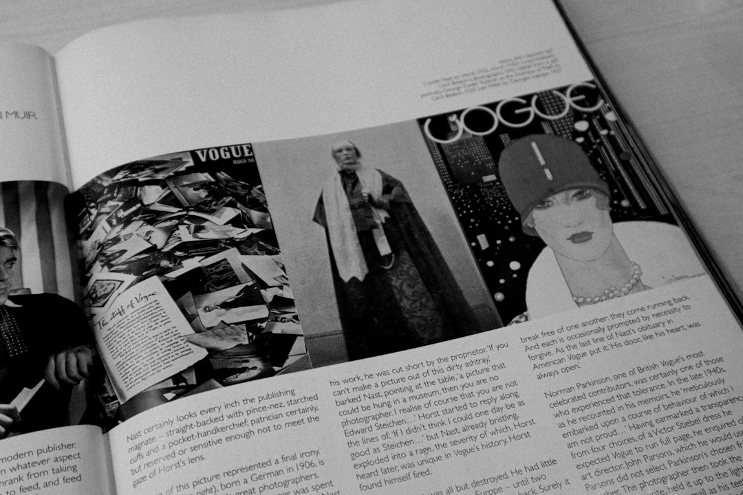
Baseline guides are particularly useful for text-heavy designs. They align lines of type across columns and pages, improving rhythm and readability. This is especially important in editorial layouts, annual reports, catalogs, and long-form documents.
When text baselines are inconsistent, the page may feel uneven even if the margins and columns are correct. A baseline grid helps ensure that body text, captions, footnotes, and side notes relate to each other in a disciplined way. It also supports better vertical spacing between headings, paragraphs, and images.
To use baseline guides effectively, define a body text size and line height first. Then build the vertical rhythm around that measurement. If the body text uses a 10-point size with 14-point leading, the layout’s vertical spacing should respect that rhythm wherever possible.
Establish Visual Hierarchy with Guides
Line guides are not only technical tools; they also support communication. By controlling placement, scale, and spacing, guides help establish visual hierarchy. The viewer should quickly understand what to read first, what to notice next, and what information is secondary.
Use guides to align related elements and separate unrelated ones. A heading, subheading, and button may align along the same vertical guide to show they belong together. A testimonial block might sit in a separate column or zone to distinguish it from the main text. These decisions help the viewer process information without confusion.
Hierarchy should never depend on size alone. Alignment, spacing, contrast, and grouping are equally important. A carefully guided layout can make even dense information appear calm and accessible.
Keep Spacing Consistent
Inaccurate spacing is one of the most common signs of weak layout design. If one section uses 20 pixels between a heading and paragraph while another uses 37 pixels without reason, the page can feel inconsistent. Line guides help avoid arbitrary decisions by turning spacing into a system.
Create spacing rules for common relationships, such as:
- Distance between headings and body text
- Space above and below images
- Gutters between columns
- Padding inside cards, buttons, and panels
- Separation between sections
Many teams use spacing increments such as 4, 8, 12, 16, 24, or 32 pixels for digital design. Print layouts may use points, millimeters, or picas. The unit matters less than the consistency. A measured spacing system makes layouts easier to review, scale, and hand off.
Use Guides for Collaboration and Review
Line guides become even more valuable when multiple people are involved. Designers, copywriters, developers, printers, and project managers all benefit from a clear layout structure. Guides reduce ambiguity and make feedback more precise.
Instead of saying, “This image looks slightly off,” a reviewer can say, “The image should align to the left column guide.” This kind of feedback is faster, clearer, and less subjective. In production environments, that clarity can prevent errors and save time.
For digital products, guides also help developers understand intended spacing and alignment. For print, they help ensure that folds, cuts, and binding areas are respected. In both cases, guides act as a bridge between design intent and final execution.

Avoid Overcomplicating the Guide System
While guides are essential, too many can become counterproductive. A cluttered workspace filled with unnecessary lines may make decisions harder rather than easier. The best guide systems are clear, purposeful, and easy to follow.
Use guides for important structural decisions, not every minor adjustment. If a guide no longer serves the layout, remove it or hide it. Maintain a distinction between primary guides, such as margins and columns, and temporary guides used for individual adjustments.
A practical approach is to review guides in layers:
- Primary structure: page size, margins, bleed, and safe zones.
- Content structure: columns, gutters, and major content areas.
- Detail structure: baselines, spacing intervals, and object alignment.
Check Alignment Before Final Output
Before exporting or publishing a design, conduct a final guide-based inspection. Turn guides on and verify that text, images, buttons, logos, and key visual elements align as intended. Check that margins are consistent, spacing follows the established system, and no important content falls outside the safe area.
For print, also confirm bleed, trim, fold lines, and binding allowances. For digital, test the layout at relevant screen sizes and confirm that the guide logic still holds. A layout that looks accurate at one size may break when scaled or adapted.
Final checks are not just technical housekeeping. They protect the professionalism of the work. A well-aligned design signals care, reliability, and attention to detail.
Conclusion
Line guides are a foundation of accurate layout design. They help designers create order, control spacing, strengthen hierarchy, and maintain consistency across formats. Used properly, they reduce guesswork and support better decisions from concept to final delivery.
The most effective guide systems are planned early, kept simple, and applied consistently. They respect the format, support the content, and make collaboration easier. In serious design work, precision is not optional; it is part of the message. Line guides make that precision visible, even when the guides themselves are not.